
When discussing globally recognizable brands, Lay’s stands among a select group whose visual identity transcends borders, languages, and cultures.
The Lay’s logo is not merely a brand marker placed on a bag of potato chips; it is a carefully constructed visual narrative that reflects nearly a century of innovation, marketing foresight, and emotional connection with consumers.
Its familiar golden circle, vibrant red ribbon, and soft, inviting typography represent far more than aesthetic choices—they are the result of deliberate branding strategy rooted in history, psychology, and consumer behavior.
At first glance, the Lay’s logo appears simple and friendly. Yet beneath this simplicity lies a complex story of brand evolution, corporate growth, and design refinement.
Each element has been carefully developed to communicate trust, joy, energy, and consistency—qualities that have helped Lay’s become one of the most successful and beloved snack brands in the world.

The Birth of Lay’s: A Humble Beginning with a Clear Vision
The story of Lay’s begins in 1932, during the Great Depression, a time when entrepreneurship required resilience, creativity, and an acute understanding of consumer needs.
Herman Lay, a young salesman from Tennessee, founded the company with a straightforward but powerful idea: to produce high-quality potato chips and distribute them efficiently to everyday consumers.
Initially, Lay’s was a small regional operation. Herman Lay personally delivered potato chips to local stores, often selling them directly from the trunk of his car.
These early efforts were defined by hands-on involvement, attention to product quality, and a strong focus on customer satisfaction. While the business itself was modest in scale, the mindset behind it was ambitious.
Herman Lay understood something that many business owners at the time overlooked—the power of branding.
Long before modern marketing theory became mainstream, he recognized that a consistent brand identity could build trust, familiarity, and loyalty. This belief would later become a cornerstone of Lay’s long-term success.
From Local Snack to National Brand
Throughout the 1940s and 1950s, Lay’s expanded rapidly across the United States. The company invested in distribution networks, standardized production processes, and increasingly sophisticated marketing strategies.

Lay’s became one of the first snack companies to advertise on television, bringing its products directly into American living rooms and reinforcing brand recognition on a national scale.
This period marked a shift from simple product-focused selling to emotionally driven marketing. Lay’s was no longer just selling potato chips; it was selling an experience—comfort, enjoyment, and reliability.
The brand began to position itself as a familiar presence in everyday life, associated with family gatherings, leisure time, and shared moments.
A major milestone came in 1961, when Lay’s merged with the Frito Company to form Frito-Lay, Inc. This merger united two highly successful snack brands with complementary strengths, creating a dominant force in the snack food industry.
The combined resources allowed for broader distribution, expanded product lines, and stronger marketing capabilities.
Later, Frito-Lay became a subsidiary of PepsiCo, one of the world’s largest food and beverage corporations. This move further solidified Lay’s global reach while preserving its individual brand identity.
Early Logo Designs and the Foundations of Visual Identity
In its earliest years, the Lay’s logo was relatively simple, often consisting of bold typography that emphasized brand recognition rather than symbolic depth.
These early designs reflected the practical needs of a growing business—clarity, readability, and consistency across packaging and advertising.
As the company expanded and competition increased, the importance of visual identity became more pronounced. A logo was no longer just a name; it was a tool for differentiation. Lay’s began to refine its branding, moving toward designs that were not only recognizable but also emotionally engaging.

This evolution mirrored broader trends in advertising and consumer psychology. Brands that could create emotional connections were more likely to earn long-term loyalty, and visual elements played a critical role in that process.
The Introduction of the Golden Circle
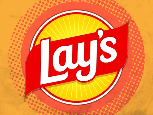
One of the most defining features of the modern Lay’s logo is the golden yellow circle that serves as its backdrop. This element was introduced as the brand sought a more cohesive and impactful visual identity, particularly following the formation of Frito-Lay.
The circular shape is significant. Circles are often associated with unity, wholeness, and continuity—concepts that align well with a brand built on consistency and reliability. The choice of yellow further enhances this symbolism.
In color psychology, yellow is commonly linked to happiness, warmth, optimism, and energy. It is an attention-grabbing color that naturally draws the eye, making it ideal for retail environments where products compete for visibility.
For Lay’s, the yellow circle evokes a sense of friendliness and approachability, creating a positive first impression even before a consumer reads the brand name.
The golden tone also subtly references the product itself—crispy, golden potato chips—creating a visual connection between the logo and the snack inside the bag.
The Red Ribbon: Movement, Energy, and Appetite Appeal
Complementing the yellow circle is the iconic red swoosh or ribbon that flows across the logo. This dynamic element adds a sense of motion and vitality, preventing the design from feeling static or flat.
Red is one of the most powerful colors in branding, particularly within the food industry. It is known to stimulate appetite, increase heart rate, and evoke feelings of excitement and passion.
By incorporating red into its logo, Lay’s taps into these psychological effects, subtly encouraging consumption while reinforcing the brand’s energetic personality.

The ribbon-like shape also introduces a sense of playfulness and movement, suggesting freshness and enjoyment. It visually guides the eye across the logo, creating balance and harmony between the circular background and the typography.
Strategic Alignment with Frito-Lay
While Lay’s maintains a distinct identity, its logo also reflects its relationship with the broader Frito-Lay brand. The use of a circular emblem and warm color palette aligns Lay’s visually with other products under the Frito-Lay umbrella, reinforcing a sense of corporate consistency and shared quality standards.
This strategic alignment benefits consumer perception. Shoppers may not consciously analyze corporate structures, but visual cohesion helps build trust.
The logo signals that Lay’s is part of a reputable, established family of snack brands known for quality and reliability.
At the same time, Lay’s retains its unique personality—softer, more playful, and more universally approachable—ensuring that it does not lose its individual character within a larger corporate framework.
Branding as a Long-Term Strategy
The evolution of the Lay’s logo demonstrates a fundamental principle of successful branding: consistency paired with gradual refinement.
Rather than undergoing drastic redesigns that could confuse or alienate consumers, Lay’s has implemented incremental updates over the decades.
These changes have modernized the logo while preserving its core elements—the yellow circle, red ribbon, and friendly typography. This approach allows the brand to remain relevant in changing markets without sacrificing recognition.
By the time Lay’s became a global brand, its logo was already deeply embedded in consumer memory. Each update served to sharpen and enhance what was already familiar, strengthening emotional connections rather than disrupting them.
While color and shape form the immediate visual impact of the Lay’s logo, typography plays an equally critical role in shaping how the brand is perceived.
The lettering used in the Lay’s logo is intentionally rounded, smooth, and flowing—an approach that aligns perfectly with the brand’s promise of enjoyment, comfort, and accessibility.
Unlike rigid or sharp-edged typefaces that can convey seriousness or formality, Lay’s typography feels friendly and relaxed, reinforcing the idea that this is a snack meant to be enjoyed by everyone.
Typography as a Tool of Emotional Branding
Typography is often underestimated in logo design, yet it is one of the most powerful tools for shaping emotional perception. In the case of Lay’s, the rounded letterforms communicate warmth and familiarity.
The absence of harsh angles makes the logo visually soft, which subconsciously signals approachability and ease.
This design choice is especially important for a mass-market consumer brand. Lay’s products are consumed by people of all ages, backgrounds, and cultures.
The typography avoids exclusivity or elitism, instead embracing inclusiveness. It feels playful enough to appeal to children, yet refined enough to remain credible and appealing to adults.
The integration of the typography with the red ribbon enhances this effect. The letters appear to flow naturally with the swoosh, creating a sense of movement and continuity. This visual harmony contributes to memorability, making the logo easy to recall even after brief exposure.
Precision and Balance in Design Execution
Every detail of the Lay’s logo—from letter spacing to proportions—has been carefully refined over time. The balance between the boldness of the text and the softness of its curves ensures legibility at various sizes, whether on a large billboard, a small snack bag, or a digital screen.
This adaptability is essential in modern branding. A logo must perform consistently across physical packaging, television advertising, mobile devices, social media platforms, and international markets. Lay’s design achieves this versatility without sacrificing clarity or emotional impact.
The logo’s scalability is one of its greatest strengths. Even when reduced to small dimensions, the brand name remains clear and recognizable, preserving its visual identity across all applications.
The Psychology Behind Consumer Response
The Lay’s logo is a textbook example of how branding leverages human psychology. Consumers often make purchasing decisions in seconds, relying on visual cues rather than rational analysis. The logo’s colors, shapes, and typography work together to create an immediate emotional response.
Yellow triggers feelings of happiness, warmth, and optimism. Red adds excitement and stimulates appetite. Rounded typography fosters trust and friendliness. Combined, these elements create a powerful psychological signal: this product is enjoyable, familiar, and satisfying.
Importantly, these effects operate both consciously and subconsciously. A consumer may not actively think about color psychology, but the emotional response still influences behavior. This is why the Lay’s logo remains effective even after decades of exposure—it continues to evoke positive feelings without requiring conscious effort.
Cultural Impact and Everyday Presence
Over time, the Lay’s logo has become deeply embedded in popular culture. It is associated with everyday moments of relaxation, celebration, and social connection. From casual snacking at home to gatherings with friends, sporting events, and road trips, Lay’s has positioned itself as a companion to shared experiences.
This cultural presence extends beyond advertising. The logo appears in films, television shows, social media content, and user-generated posts, reinforcing its familiarity. It has become a visual shorthand for comfort and indulgence, instantly recognizable even when partially obscured or stylized.
Few brands achieve this level of cultural integration. The Lay’s logo does not merely represent a product—it represents a feeling, a habit, and a shared experience across generations.
Global Recognition and Localization
Lay’s is sold in more than 100 countries, making global consistency a crucial aspect of its branding strategy. The logo serves as an anchor of familiarity, ensuring that consumers recognize the brand regardless of language or regional differences.
At the same time, Lay’s successfully adapts to local markets. Packaging may feature region-specific flavors, imagery, or language variations, but the core logo remains unchanged. This balance between global consistency and local relevance is a hallmark of effective international branding.
In some regions, the Lay’s brand appears under the name “Walkers,” particularly in the United Kingdom and parts of Europe.
Even in these cases, the visual design principles—color palette, typography style, and overall aesthetic—remain closely aligned, preserving brand equity while respecting local market preferences.
The Logo in Modern Marketing and Digital Media
As marketing has shifted toward digital platforms, the Lay’s logo has proven remarkably adaptable. Whether displayed as a social media profile icon, a video watermark, or part of an interactive online campaign, the logo maintains its clarity and emotional appeal.
Digital marketing requires logos to perform under new conditions: small screen sizes, fast scrolling behavior, and brief attention spans.
The simplicity of the Lay’s logo makes it ideal for these environments. Its bold colors and clean composition ensure immediate recognition, even in crowded digital spaces.
The logo also plays a central role in integrated marketing campaigns. It reinforces brand identity across television commercials, influencer collaborations, online advertisements, and in-store displays. This consistency strengthens brand recall and reinforces consumer trust.
Incremental Evolution, Not Radical Change
One of the most important lessons from the Lay’s logo is the value of gradual evolution. Rather than introducing dramatic redesigns that could disrupt consumer recognition, Lay’s has refined its logo through subtle updates.
These changes often involve minor adjustments to color saturation, typography smoothing, or proportion refinement. Each update modernizes the logo while preserving its essence. This strategy respects the emotional bond consumers have developed with the brand over time.
By maintaining continuity, Lay’s avoids the risk of alienating loyal customers while still staying relevant in a competitive and evolving marketplace.
Symbolism Beyond the Product
The Lay’s logo represents more than potato chips. It symbolizes decades of innovation, marketing excellence, and consumer trust. It reflects the journey from a small regional business to a global snack food leader, guided by strategic branding decisions and an understanding of human behavior.
The logo communicates reliability—consumers know what to expect when they see it. It also communicates joy, positioning Lay’s as a simple pleasure in everyday life. This combination of trust and enjoyment is rare and powerful.
In many ways, the logo functions as a promise. It assures consumers of consistent quality, familiar taste, and a positive experience. This promise is reinforced every time the logo appears, strengthening the relationship between brand and consumer.
Simplicity as a Design Philosophy
Despite its depth of meaning, the Lay’s logo remains remarkably simple. A circle, a ribbon, and text—these elements alone create one of the most recognizable visual identities in the world.
This simplicity is intentional. Effective logos do not rely on complexity; they rely on clarity and emotional resonance. The Lay’s logo demonstrates how minimal design can carry substantial meaning when executed thoughtfully.
By avoiding unnecessary detail, the logo remains timeless. It does not feel dated or overly tied to a specific design trend, which contributes to its longevity and global appeal.
Conclusion: A Masterclass in Branding Excellence
The Lay’s logo is far more than a decorative element on snack packaging. It is a carefully crafted symbol that embodies the brand’s history, values, and emotional connection with consumers.
From its origins in a small Tennessee business to its status as a global icon under PepsiCo, Lay’s has used its logo as a strategic tool for growth, recognition, and trust.
Every design choice—the golden yellow circle, the energetic red ribbon, the rounded typography—serves a purpose. Together, they create a visual language that communicates warmth, energy, reliability, and joy. This language transcends cultural and linguistic boundaries, allowing Lay’s to connect with consumers around the world.
The enduring success of the Lay’s logo demonstrates the power of thoughtful branding. It shows how design, when guided by psychology, consistency, and authenticity, can elevate a simple product into a cultural symbol.
The next time you open a bag of Lay’s potato chips, you are not just enjoying a snack. You are engaging with nearly a century of branding expertise, innovation, and emotional storytelling—condensed into a logo that continues to resonate across generations.
In a world of constant change, the Lay’s logo stands as proof that great design is timeless, purposeful, and deeply human.